Quid's Generative AI empowers you to gain an unmatched and holistic view of the customer context. Beyond just capturing data, we enable you to see data through the lens of the future.


TRUSTED by the world’s most valuable brands


Using Generative AI, Quid is the only platform that gives a holistic view of your customers’ context. Going beyond just capturing data, we look at data through the lens of the future. Smarter than just listening. More intuitive. More insightful. Turning patterns into predictions and predictions into profits. The tools of yesterday will leave you and your business stuck in the past. Because we know, now more than ever, the only way to get ahead is to look ahead.
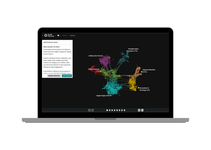
Quid Discover helps you uncover insights in a totally new way. Millions of raw data points from different channels are organized, connected, and visualized. Quid Discover allows you to create customer and market context and see what's next while allowing you to deeply understand customer conversations, media trends, corporate innovation, funding and more. Unmet needs are found, trends are uncovered, and strategic decisions are made with unprecedented, efficient clarity.
Visualize connections to understand what's really going on.
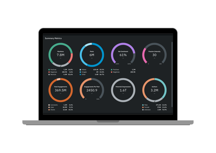
The world doesn’t stop for anyone or any business. As the market-leading social media analytics tool, Quid Monitor seamlessly connects with the most comprehensive set of consumer and market intelligence data sources to take social media analytics to unprecedented heights.
Find and continuously track millions of conversations in real time.
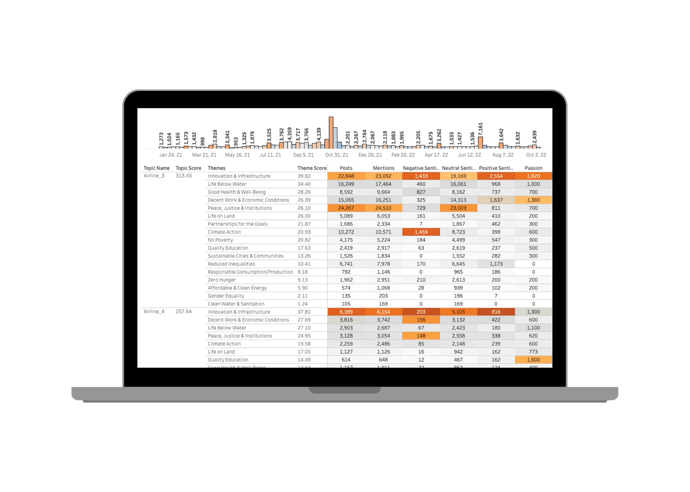
Quid Predict filters out the noise, sifting through millions of weak signals to continuously discover emerging themes or entities across any topic of interest. By uncovering what is important now and predicting future relevance, Quid Predict guides your focus to the most significant trends or opportunities. By consistently seeing around the corner for what’s next, you can better allocate time and resources, supercharging your organization with proactive, data-driven decisions.
Bring your future into focus.
.png?width=690&height=493&name=Predict%20(2).png)
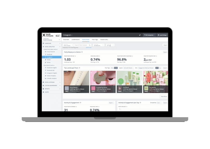
It’s hard to know what success looks like until you can see where you stand. Quid Compete helps you crush your competition with on-demand social media analytics, alerts, and custom reports. Companies all over the world rely on Quid Compete to help them make smarter social media decisions. We feature all of your paid, organic, and competitive social stats alongside the customizable dashboards and reports of your dreams.
Your compass in the digital world.
Quid Connect allows you to continuously pass data and metrics out of the Quid environment, expanding the possibilities for how you incorporate Quid insights into your decision making. Real-time integration facilitates fast action on what matters most, including emerging trends, market shifts, or competitive activity. Clear, accurate, and automated insights empower data-driven decisions so you can move in the right direction: forward.
Expand your possibilities.
).gif?width=690&height=690&name=Copy%20of%20Template%20-%20Design-%20Paid%20Ads%20-%201200%20x675%20(Instagram%20Post%20(Square)).gif)
).jpg?width=690&height=690&name=Copy%20of%20Template%20-%20Design-%20Paid%20Ads%20-%201200%20x675%20(Instagram%20Post%20(Square)).jpg)